티스토리 뷰
HTML Layout Elements
- <header>
- <nav>
- <section>
- <article>
- <aside>: like a sidebar
- <footer>
- <details>
- <summary>

HTML Layout Technique 4가지
- CSS framework
- CSS float property
- float
- clear
- CSS flexbox
- CSS grid
- float나 flexbox을 사용할 필요 없이 rows와 columns을 가진 grid-based layout system을 제공해 더 쉽게 디자인 할 수 있다.
연습하기
CSS Float layout

- 우선 layout을 나누는 것이 중요하다. header, section, footer. 그리고 section 안에는 nav와 article.
- nav와 article이 서로 다닥 붙어서 나타나도록 하기 위해서는 float를 사용한다.
- responsive layout으로 만들기 위해 (화면을 축소 시켰을 경우 각각의 column이 서로 위에 쌓이도록 하는 것) @media 에서 width 100%, height: auto 설정을 해주어야 한다.
- *을 이용해서 전체 설정은 box-sizing: border-box으로 해주도록 하자.
<!DOCTYPE html>
<html lang="en">
<head>
<title>CSS Template</title>
<meta charset="utf-8">
<meta name="viewport" content="width=device-width, initial-scale=1">
<style>
* {
box-sizing: border-box;
}
body {
font-family: Arial, Helvetica, sans-serif;
}
/* Style the header */
header {
background-color: #666;
padding: 30px;
text-align: center;
font-size: 35px;
color: white;
}
/* Create two columns/boxes that floats next to each other */
nav {
float: left;
width: 30%;
height: 300px; /* only for demonstration, should be removed */
background: #ccc;
padding: 20px;
}
/* Style the list inside the menu */
nav ul {
list-style-type: none;
padding: 0;
}
article {
float: left;
padding: 20px;
width: 70%;
background-color: #f1f1f1;
height: 300px; /* only for demonstration, should be removed */
}
/* Clear floats after the columns */
section:after {
content: "";
display: table;
clear: both;
}
/* Style the footer */
footer {
background-color: #777;
padding: 10px;
text-align: center;
color: white;
}
/* Responsive layout - makes the two columns/boxes stack on top of each other instead of next to each other, on small screens */
@media (max-width: 600px) {
nav, article {
width: 100%;
height: auto;
}
}
</style>
</head>
<body>
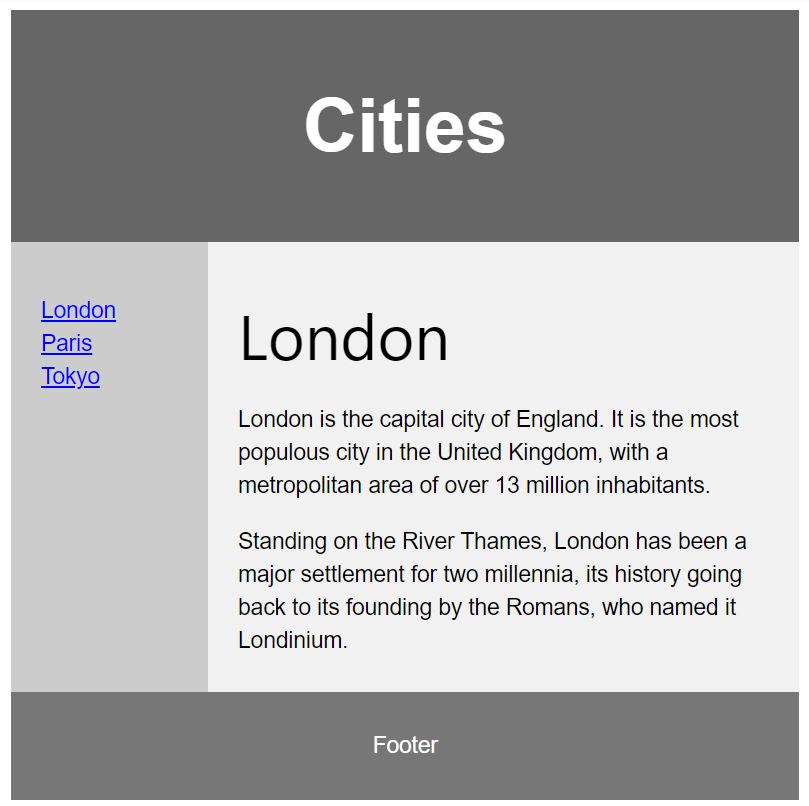
<header>
<h2>Cities</h2>
</header>
<section>
<nav>
<ul>
<li><a href="#">London</a></li>
<li><a href="#">Paris</a></li>
<li><a href="#">Tokyo</a></li>
</ul>
</nav>
<article>
<h1>London</h1>
<p>London is the capital city of England. It is the most populous city in the United Kingdom, with a metropolitan area of over 13 million inhabitants.</p>
<p>Standing on the River Thames, London has been a major settlement for two millennia, its history going back to its founding by the Romans, who named it Londinium.</p>
</article>
</section>
<footer>
<p>Footer</p>
</footer>
</body>
</html>
CSS Flexbox layout
위와 같은 layout을 flexbox layout으로 설정할 경우
<!DOCTYPE html>
<html lang="en">
<head>
<title>CSS Template</title>
<meta charset="utf-8">
<meta name="viewport" content="width=device-width, initial-scale=1">
<style>
* {
  box-sizing: border-box;
}

body {
  font-family: Arial, Helvetica, sans-serif;
}

/* Style the header */
header {
  background-color: #666;
  padding: 30px;
  text-align: center;
  font-size: 35px;
  color: white;
}

/* Container for flexboxes */
section {
  display: -webkit-flex;
  display: flex;
}

/* Style the navigation menu */
nav {
  -webkit-flex: 1;
  -ms-flex: 1;
  flex: 1;
  background: #ccc;
  padding: 20px;
}

/* Style the list inside the menu */
nav ul {
  list-style-type: none;
  padding: 0;
}

/* Style the content */
article {
  -webkit-flex: 3;
  -ms-flex: 3;
  flex: 3;
  background-color: #f1f1f1;
  padding: 10px;
}

/* Style the footer */
footer {
  background-color: #777;
  padding: 10px;
  text-align: center;
  color: white;
}

/* Responsive layout - makes the menu and the content (inside the section) sit on top of each other instead of next to each other */
@media (max-width: 600px) {
  section {
    -webkit-flex-direction: column;
    flex-direction: column;
  }
}
</style>
</head>
<body>

<header>
  <h2>Cities</h2>
</header>

<section>
  <nav>
    <ul>
      <li><a href="#">London</a></li>
      <li><a href="#">Paris</a></li>
      <li><a href="#">Tokyo</a></li>
    </ul>
  </nav>

  <article>
    <h1>London</h1>
    <p>London is the capital city of England. It is the most populous city in the  United Kingdom, with a metropolitan area of over 13 million inhabitants.</p>
    <p>Standing on the River Thames, London has been a major settlement for two millennia, its history going back to its founding by the Romans, who named it Londinium.</p>
  </article>
</section>

<footer>
  <p>Footer</p>
</footer>

</body>
</html>
공지사항
최근에 올라온 글
최근에 달린 댓글
- Total
- Today
- Yesterday
링크
TAG
- HTML_Formatting
- text_shadow
- css
- HTML #id #iframe
- HTML #media #video #YouTube
- HTML #Canvas #SVG
- box_model
- Block_element #inline_element
- links lists tables display
- JSP_CRUD
- HTML #CSS
- javascript #datatype
- 2020Camp
- STS4
- UserBean
- JSP환경구축
- HTML #Tables
- fontstyle
- HTML #class
- DynamicWebProject
- DB4free
- jsp
- meta #link #script #base #HTML
- HTML_Forms
- head #title #style
- Mavenproject
- 인용문 #주석
- html
- HTML #Headings #Paragraph #Styles
- annotation
| 일 | 월 | 화 | 수 | 목 | 금 | 토 |
|---|---|---|---|---|---|---|
| 1 | 2 | 3 | ||||
| 4 | 5 | 6 | 7 | 8 | 9 | 10 |
| 11 | 12 | 13 | 14 | 15 | 16 | 17 |
| 18 | 19 | 20 | 21 | 22 | 23 | 24 |
| 25 | 26 | 27 | 28 | 29 | 30 | 31 |
글 보관함